6 Elements to Include On Your eCommerce Landing Page

The first thing you do when you arrive on an eCommerce landing page is start scrolling, sometimes even before the page has fully loaded. This is often an automatic, subconscious behavior.
The elements you see as you scroll, and the order you encounter them in, all contributes to your brand and buyer experience.
High performing landing pages all incorporate certain content pieces that inform, reassure, and encourage conversions.
In this article, we’ll cover the elements you should include in your eCommerce landing pages and why they’re so important for conversion, brand-building, and retention.
Landing pages: The what and why
Before we move on, let’s dig into what landing pages are and their purpose.
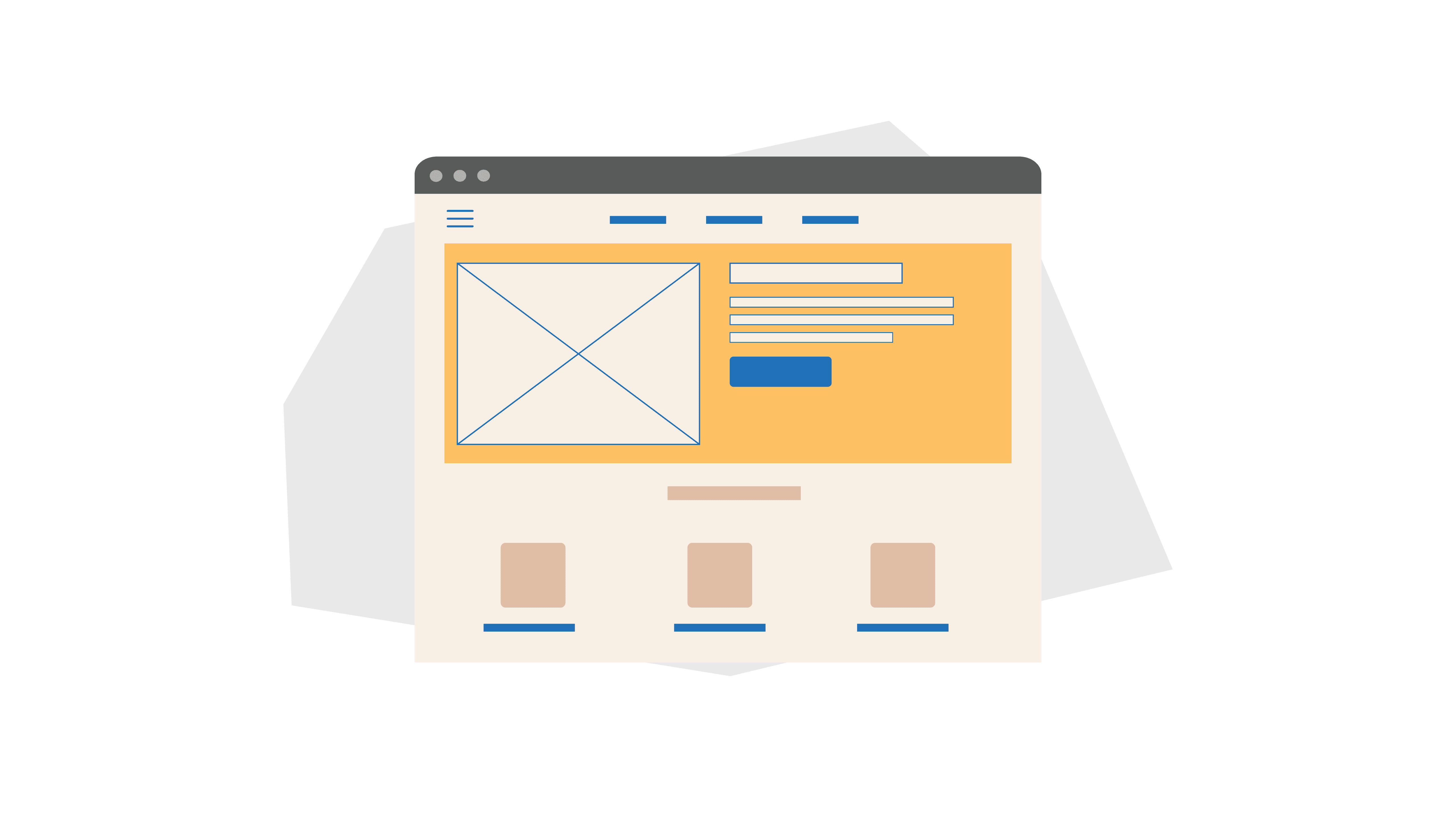
A landing page is different from your website’s home page. It’s a standalone web page created specifically for a marketing or advertising campaign.
This is where a visitor “lands” when clicking through an ad or other piece of content from a third-party platform that redirects them to your website.
Unlike your website home page, landing pages are hyperfocused on a particular campaign or product and guide visitors towards a single call to action (CTA).
Most likely, your landing pages are product-specific, and the CTA is “Buy now.”
Landing pages are designed to drive conversion, while home pages and websites are designed for exploration.
Why use landing pages?
In eCommerce, landing pages are an important part of your sales funnel. They serve as the link between your customer seeing your ad campaigns and going to your online store to purchase their items. Outside of their obvious role in sales, landing pages can be beneficial to other elements of your marketing efforts.
According to BigCommerce, landing pages also:
- Drive higher ROI for paid traffic
- Are great for testing
- Target specific customer segments
- Are quick and easy to put together
That last point is especially important as we move on. Because landing pages are simple and fast to put together, it’s equally easy to overlook important elements during landing page creation that will help you achieve your goals.
Not all landing pages are the same, so you need to rely on your goals to guide development.
Personalized vs. one-size-fits-all
The ultimate goal of landing pages is the same: to increase sales. But savvy merchants know you have to sell differently to different targets.
Landing pages are key to the sales funnel, but they can also be customized to meet shoppers at various stages of the sales funnel to help move them along the buyer journey.
Top-of-funnel
Top-of-funnel landing pages are designed to introduce your brand to new visitors. They’re first-impression pages, making it especially important to include content that demonstrates your brand story, presents your products and their benefits, and establishes credibility.
Since visitors are likely not ready to buy, the CTA might focus more on connection and lead generation, such as offering a discount for sharing their email and signing up for your newsletter.
Mid-funnel
The middle of the funnel landing pages are designed for customers who’ve visited your site, but have not yet made a purchase. These pages are most commonly used in retargeting campaigns — hitting shoppers who are familiar with your brand and may have even picked out some goodies.
Content on these pages should focus on nudging them towards checkout. This can include content about specific products they’ve engaged with, social proof, or limited time to induce a sense of urgency that inspires quick action.
Bottom-of-funnel
Often, a customer will add to their cart and maybe even go through the steps to buy, but fail to complete the checkout process. In these instances, you target ”bottom-of-funnel” customers through upselling campaigns that feature customized landing pages.
Upselling content works well on these landing pages because customers are already in a buying mindset, presenting you with the opportunity to sweeten the deal.
Existing customers
Some landing pages are designed to keep existing customers happy and inspire them to come back to your store to buy again. Reengagement and retention campaigns leverage them to boost customer lifetime value (CLV). These pages can skip over content about who you are and what your products are about to instead focus on delivering added value to your customers, such as:
- Customer loyalty incentives
- Sneak peeks at new products
- Early access to sales
What to include on your eCommerce landing page
Although some users will inevitably begin scrolling automatically upon arriving, it’s important to focus your efforts on the top of the landing page. This not only grabs your customers’ attention immediately, but also ensures you avoid burying the most important content at the bottom of your page where fewer shoppers are likely to scroll.
The best eCommerce landing pages draw customers in, answer their questions, and inspire them to take action.
To make yours the cream of the crop, keep the following items high on your page — with as much rich content above the fold as possible.
1) Clear, attention-grabbing headline
Writing eCommerce copy is a little different than writing typical marketing copy, but one thing remains the same: writing a great headline takes effort. A clear, attention-grabbing headline is critical whether it’s for a blog post or a campaign landing page.
Your landing page headlines should be:
- Short and to the point
- Clear about your main benefit
- Exciting
Because landing pages are an important component of your overall search engine optimization (SEO) strategy, implementing strong keywords is imperative. Including keywords in your headline helps improve your overall SEO and ensures you use words customers will recognize.
Another important element to include when creating your headlines is a strong message match. A message match occurs when the messaging on your landing page is aligned with the messaging shoppers originally clicked on.
2) Short, explanatory subhead
Headlines are intentionally short and sweet because they’re meant to pull in a customer and grab their attention. Meanwhile, your subhead, while still short, offers additional context and backs up the offer or promise presented in your headline.
The subhead should be three sentences or fewer and further explains how your product(s) will serve your customers and meet their needs.
3) Visual interest
The old adage is as true on landing pages as anywhere else: A picture is worth a thousand words. In eCommerce, photographs bridge the gap left when customers are unable to interact with your products physically during the discovery and shopping journey.
An intriguing and visually appealing image is important because people process images 60,000 times faster than text.
This means your customers can gain an idea of what your product is and how it will fit into their lives much faster by viewing images (or better yet, video) than by reading a long-winded product description.
And speaking of video — using explainer videos, product demos, or even liveshopping feeds is another great way to draw in your customers and boost conversions.
4) Social proof
It’s hardly surprising why influencer marketing has taken over: Consumers seek social proof at every turn. Social proof is a type of reassurance; we use social cues throughout our lives to tell us how we should behave, including our shopping habits.
In fact, nine out of 10 consumers read reviews before they decide to buy something. Prominently displaying reviews for your customers to see provides needed social proof to transform them from window shoppers into buyers.
Social proof can be demonstrated in a number of ways:
- Customer or influencer social media posts
- Quotes from reviews and testimonials
- Five star trust ratings
Be sure to highlight this content early on to establish trust from the get-go.
5) Clear, direct, and actionable CTAs
A landing page serves many purposes, from introducing your brand to educating customers, but the ultimate goal of each one is to convert. To improve conversion rates, you must tell your customers what action to take in a clear and concise manner.
The CTA button is a prompt to take the next step towards becoming a new customer or repeat buyer. It generally takes the form of succinct ad copy coupled with a graphic designed to entice visitors to click. CTAs must be easily identified and actionable on your landing page.
Messages like “Sign up for 10% off your first purchase” or “Buy now” tell your customers exactly what to do and communicate what they can expect when they click.
The CTA will vary based on your landing page type. Top-of-funnel landing pages should focus more on capturing customer information and building connections, while landing pages targeting leads further along their buyer journey should focus on closing sales or inviting repeat business.
6) Deal highlights
Do you have special offers available to your customers or unique offerings the competition can’t touch? Give this content central placement on your landing pages to further entice customers to act quickly.
Creating scarcity or proprietary offers is a great tactic for increasing purchases through landing pages. Stressing to customers that your product, offering, or special deal can’t be found elsewhere captures the customer’s attention quickly and boosts the likelihood of convincing them to act before you lose their interest.
Landing page best practices
Landing pages can serve different parts of the sales process and target customers at various stages of the buyer journey. However, all good landing pages aim to accomplish the same basic goals, especially with eCommerce competition stiffer than ever. Whatever content you include in your landing pages, make sure to consider the following:
Consistent messaging
Establish the message match by providing relevant information that aligns with the message the customer expects to see. In marketing, this is incredibly important. To make a message match, you need to be certain the content that inspired a would-be buyer to click through to your landing page aligns with what they find when they arrive. This content needs to be targeted to the needs and interests of your customer, as well as their unique point in the buyer journey.
For example, retargeting or retention messaging in advertisements should not redirect customers to top-of-funnel landing pages (a message mismatch). Instead, retargeting or retention landing pages should skip over the brand story and early-funnel content and focus on customers’ unique needs based on past behavior.
Logical content journey
If your customers arrive on your website and feel lost or confused, it’s unlikely they’ll scroll down or convert. This results in a higher bounce rate and lost sales.
Make sure your landing pages have a logical and sequential structure and flow. This leads visitors to scroll down the page and complete your intended action (sign up for a newsletter, add to cart, bundle for savings, etc.).
You can still have a CTA higher up the page. But it’s more important that the content flow is logical and makes sense as a visitor scrolls down.
Product-lifestyle fit
Regardless of where they are in the buyer journey, all customers need to believe a product is right for them before they input their payment details. Landing pages should always be designed to answer the following question: How will this product fit into my life and/or help me?
For top-of-funnel pages, this answer might be woven into your brand story and commitment to customers. When it comes to a retargeting or retention landing page, perhaps it’s all about convenience — making it easier for your customer to buy through subscription offerings, discounts, or loyalty points or rewards.
Wrapping up — Use customized eCommerce landing pages to boost conversions
Landing pages can support your eCommerce marketing campaigns, create a cohesive buyer experience, and unify your messaging. When done well, they deliver relevant, compelling product and brand information as quickly as possible to inspire a desired action.
By including the right content and structuring your landing pages appropriately, you can boost conversion rates, expand your audience, increase customer lifetime value, and ultimately generate more revenue.
